Restaurant and hospitality insolvency rates have always been above average, driven by high operating costs and lingering post-pandemic pressures. A 2025 ASIC report showed that food and accommodation services accounted for 23% of all small business restructuring appointments. In challenging economic conditions, every decision counts. Especially the ones made at your tables.
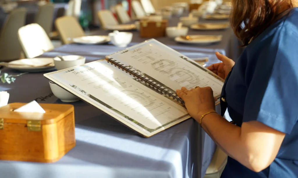
A restaurant menu isn’t just a list of dishes; it’s a powerful tool for influencing customer choices and driving revenue, even when margins are tight. Operators who treat their menu as a strategic asset routinely see profit increases of 10–15% after a thoughtful refresh, with further gains as they continue to refine.
Here are the eight “truisms” of menu design that can help lift revenue.
The “golden triangle” in the menu
Eye-tracking and observational studies show diners move their gaze to a few predictable “hotspots”. First is the centre of the page, then the upper right and upper left. Menu-engineering guides refer to this as the menu’s “sweet spots” or “golden triangle.”
How to leverage the golden triangle:
- Place your highest-margin “star” items centre stage.
- Using subtle emphasis (box, shading, icon, whitespace) to keep the eye there.
- Don’t crowd the page. Visual breathing room increases attention to what remains.
Case studies from menu-engineering firms report that moving high-margin items into the golden triangle can materially increase sales of those dishes, often citing a ~20–35% uplift for featured items, depending on venue and category. That is a typical industry range rather than a universal guarantee.
Price anchoring
Diners don’t know your food costs, portion sizes, or ideal margin mix. They decide what’s “good value” by comparing it to whatever price anchors you provide early in a category.
They compare to the first believable reference they see.
If the first steak on the list is $78, the $54 steak feels “reasonable.” That’s price anchoring. Adding a deliberately high-priced “decoy” option next to your target dish increases the target’s selection probability by making it look like the value choice. Formal hospitality research finds decoy pricing reliably shifts diners toward the intended higher-priced bundle.
How to implement price anchoring:
- Putting a premium “hero” dish at the top of a category.
- Placing their target high-margin dish directly beside or under it.
- Keep the decoy credible (same category, real offer). Fake decoys damage trust.
Remove the pain of paying
A Cornell field study found diners spent about 8% more when menus removed the dollar sign (or currency symbol). The symbol makes the cost more salient; removing it softens the “pain of paying.” Write prices as “24” not “$24.00”.
Price Frame Value
Behavioural studies show that price order matters. Presenting items from higher to lower price can raise willingness to pay, because the early prices become the mental baseline.
Where this works best:
- Wine lists
- Shared plates
- Tasting menus
- Dessert/cocktail menus
Charm prices (e.g., 19.9 or 29) signal value and can increase conversion in casual contexts, while round numbers (e.g., 30) feel premium and reduce price sensitivity in high-end settings.
Words change taste before the first bite
One of the strongest, best-replicated findings in menu psychology is that descriptive labels sell.
A Cornell field study found that adding rich, evocative descriptions increased sales of those items by ~27%, and also lifted perceived quality and value.
Descriptions trigger mental imagery, nostalgia, and expectation. You’re not just selling ingredients; you’re selling an experience.
What kind of words to use:
- Sensory cues: “crispy,” “slow-braised,” “buttery,” “smoky.”
- Provenance: “Tasmanian ocean trout,” “Hunter Valley honey.”
- Craft/process: “wood-fired,” “hand-rolled,” “24-hour marinade.”
- Emotion/story: “Nonna’s ragù,” “Sunday roast style.”
Keep it real. Over-selling creates a trust gap that hurts repeat visits.
Use visual hierarchy as a silent recommendation.
Menus that look like spreadsheets force guests to work. Menus with clear hierarchy guide decisions smoothly.
How to do it:
- Limiting highlights to a few items per page.
- Using empty space to gain attention.
- Grouping items into clean categories (Snacks / Small / Large / Sides / Sweet).
Guests interpret clarity as confidence: “they know what they’re best at.”
Photos (used carefully): speed decisions and lift take-up
Photos can work, but only when they’re high quality and aligned with your brand.
Academic research on menu imagery shows that adding pictures alongside clear descriptions increases the likelihood of selection and willingness to pay among many diners.
Industry tests suggest that even one strong photo per page can lift sales of the pictured item up to ~30% in casual and mid-market venues. The uplift is smaller (or even negative) when photos look cheap or overly “fast-food.”
Choice architecture: fewer, clearer options sell more
Too many options create decision fatigue. Guests stall, default to the safe pick, or feel anxious. Making categories tighter and clearer improves satisfaction and take-up of what remains.
How to do it:
- Keeping it simple to 6–8 mains per cuisine “story,” not 18.
- Leading with a clean category structure (e.g., Snacks / Small / Large / Sides / Sweet).
A well-designed menu reduces decision friction, sets smart price expectations, and quietly steers guests toward the dishes you most want to sell. Done with integrity, it’s one of the fastest, lowest-cost ways to lift profitability without changing your kitchen or your brand.
At Olvera, we believe that hospitality operators can thrive with the right solutions. We help owners, lenders, and managers stabilise their operations, unlock working capital, and position assets for value in a market where demand is recovering, but costs and insolvency risk remain high.